Share this Post!

Effective communication is one of the key transferable skills which universities try to develop in their students. Although we as academics spend a lot of time teaching transferable skills to students, it seems -from my experience- that we sometimes forget to develop some of those skills and/or implement them in our daily academic practice.

The idea of this article started when I attended a research webinar in which the presenter, who was a famous professor at a respectful university, did not put their PowerPoint presentation on the ‘slide show’/’wide screen’ mode; which made the slides very small on my 14” laptop screen. As this was not bad enough, the slides were not readable due to various formatting and design issues. This prompted me to prepare some exercises aimed to help students/academics develop readable yet good-looking slides.

In this article, I included exercises about five different seniors containing many of the mistakes which I have observed from presentations by students and academics. In each exercise, I explained the main issues in the presentation’s slides and my proposed solution to them. If you prefer to check the original slides and those which I improved, then you can download the PowerPoint file by clicking on the button below. You can also watch the YouTube video, at the end of this article, in which I explained the issues in all the five exercises, and demonstrated how to fix them and improve the readability of the slides.

Disclaimer: The exercises and supporting materials included in this article contain texts that were copied/pasted from random blogs and websites. As the exercises focus on the slide design and text formatting; the texts were not included for their information value, but as materials to demonstrate the slide design and text formatting techniques on. Therefore, the sources, from which the texts were taken, were not cited and the original texts were not paraphrased. However, here are the links to the used sources: Source1, Source2, Source3, and Source4.

Exercise 1

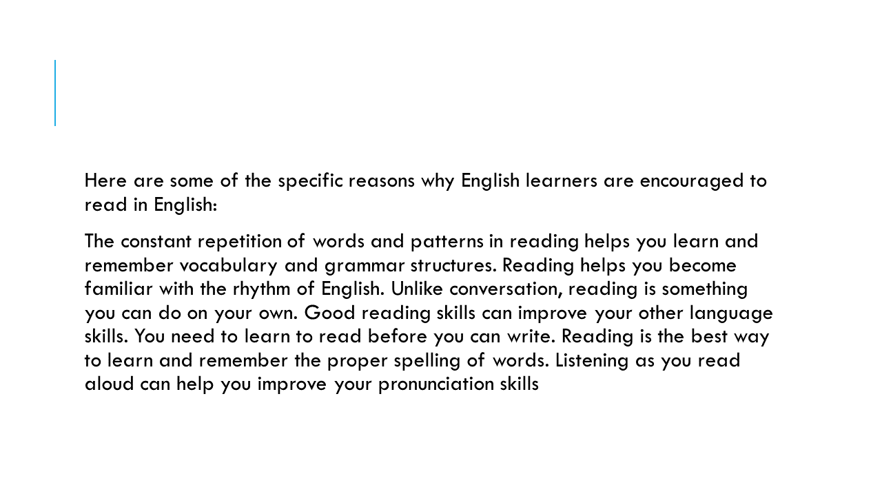
Issues with the Slide
  • There is no slide title, but a long sentence describing what is covered in the next paragraph.
  • The core slide’s content is presented in one big paragraph.
  • It is not easy to quickly see when each paragraph starts and ends.
  • The content is probably too much for one slide.
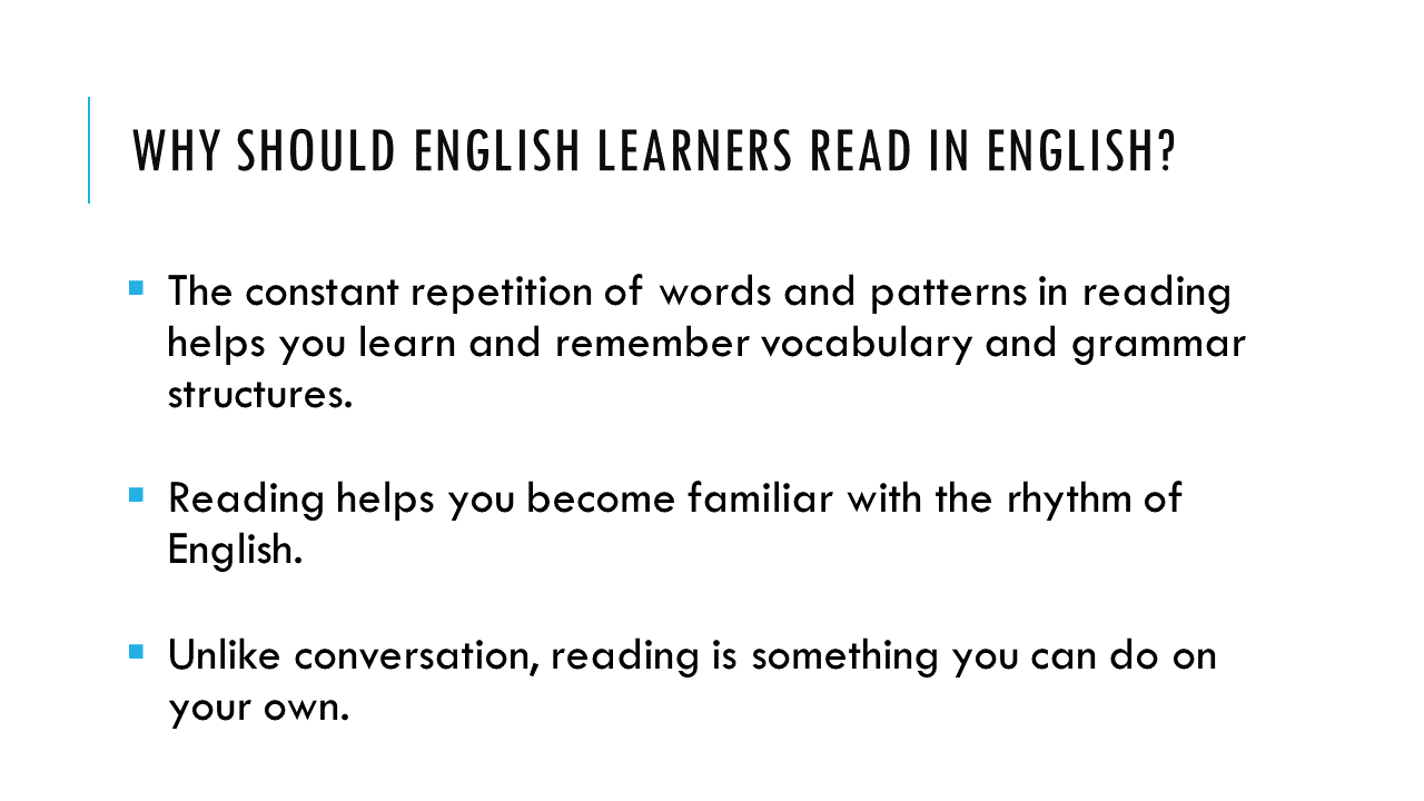
Proposed Solutions
  • Convert the first sentence into an informative but concise title which you should move to the top of the slide.
  • Divide the big paragraph into separate bullet points (think about why multiple bullet points in the slide would be more helpful, than a big paragraph, to both the presenter and audience).
  • Add a bullet-point symbol and increase the spacing between paragraphs/bullet points.
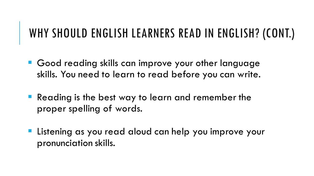
  • Divide the content into two slides if needed. Make sure to add “(Cont.)” at the end of the second slide’s title.

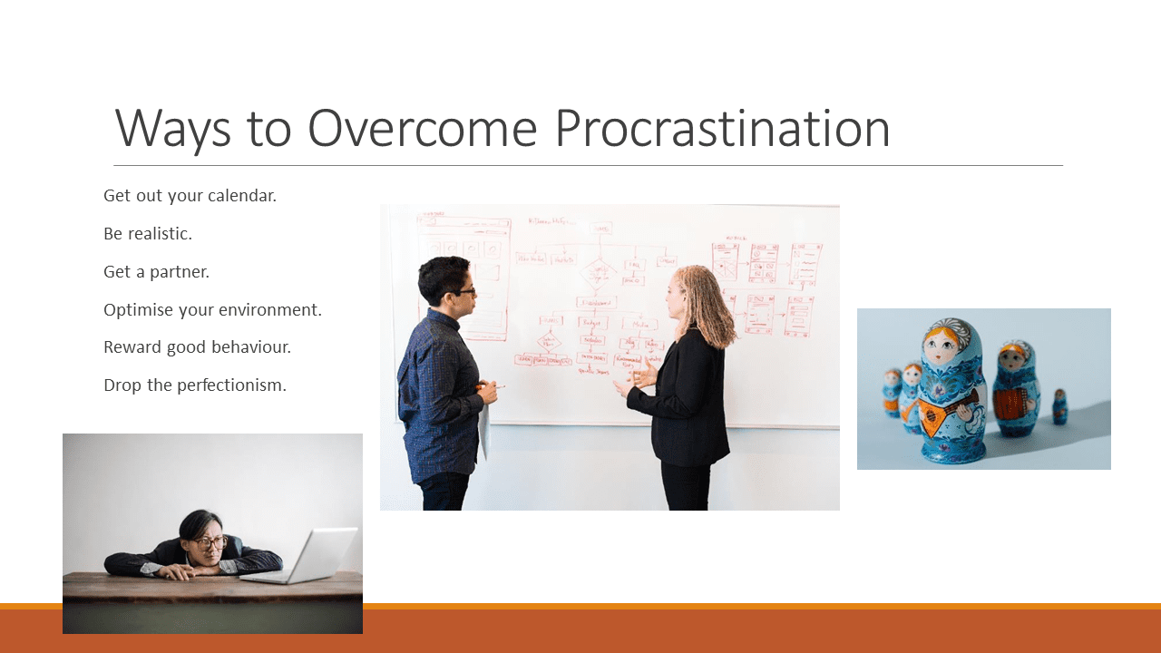
Exercise 2

Issues with the Slide
  • At least one of the included images does not directly support the ideas presented in the slide.
  • A significantly larger portion of the slide’s space is used for images rather than text.
  • The included text is quite unreadable.
  • Two of the included images illustrate contrasting situations, which makes it difficult to understand the exact message to be conveyed by these images.
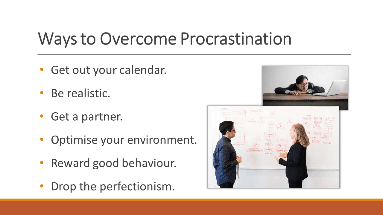
Proposed Solutions
  • Remove the ‘Matryoshka doll’ image, as it does not directly support the ideas presented in the slide.
  • Move the remaining two images to the slide’s right-hand side to free some space for the text.
  • To make the text more readable; add a bullet-point symbol, and increase the font size and spacing between bullet points.
  • To tell a story by these images; place the image illustrating the pre-/undesirable situation in the back and make it smaller, and place the image illustrating the post-/desirable situation in the front and make it substantially larger than the other image. You can also use formatting and animations to make this arrangement more noticeable.

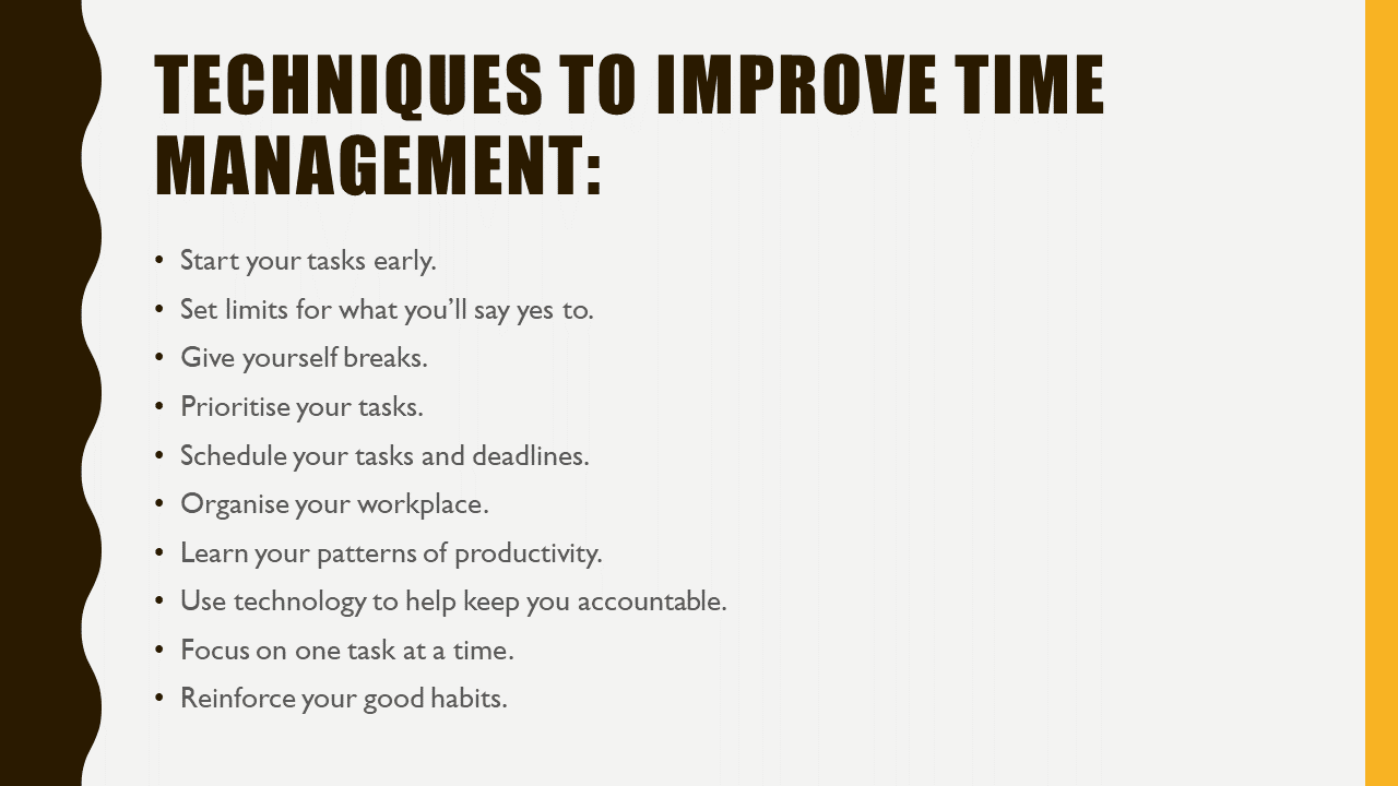
Exercise 3

Issues with the Slide
  • The slide title is unnecessarily presented in two lines.
  • The text is small and unreadable, as all the bullet points are clustered on the slide’s left-hand side; whereas, there is a big empty/unused space in the slide’s body.
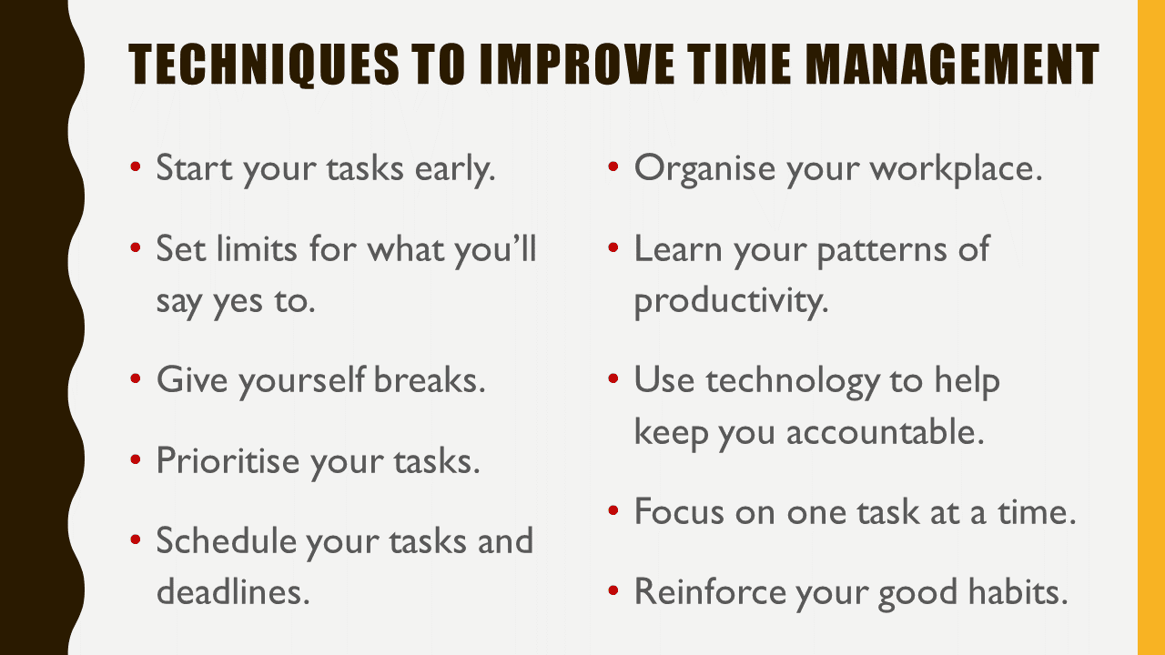
Proposed Solutions
  • Reduce the title’s font size, and delete the “:” symbol.
  • Put the bullet points in two columns.
  • Increase the font size and spacing between bullet points.
  • Make the bullet-point symbol more noticeable by changing its colour to ‘red’.

Exercise 4

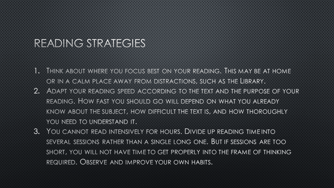
Issues with the Slide
  • The slide’s background is very dark, while the font is thin; which makes the text unreadable.
  • The bullet points contain too much text, and they are too close to each other.
  • The portion of the slide’s body which is allocated to the slide title is unreasonably large.
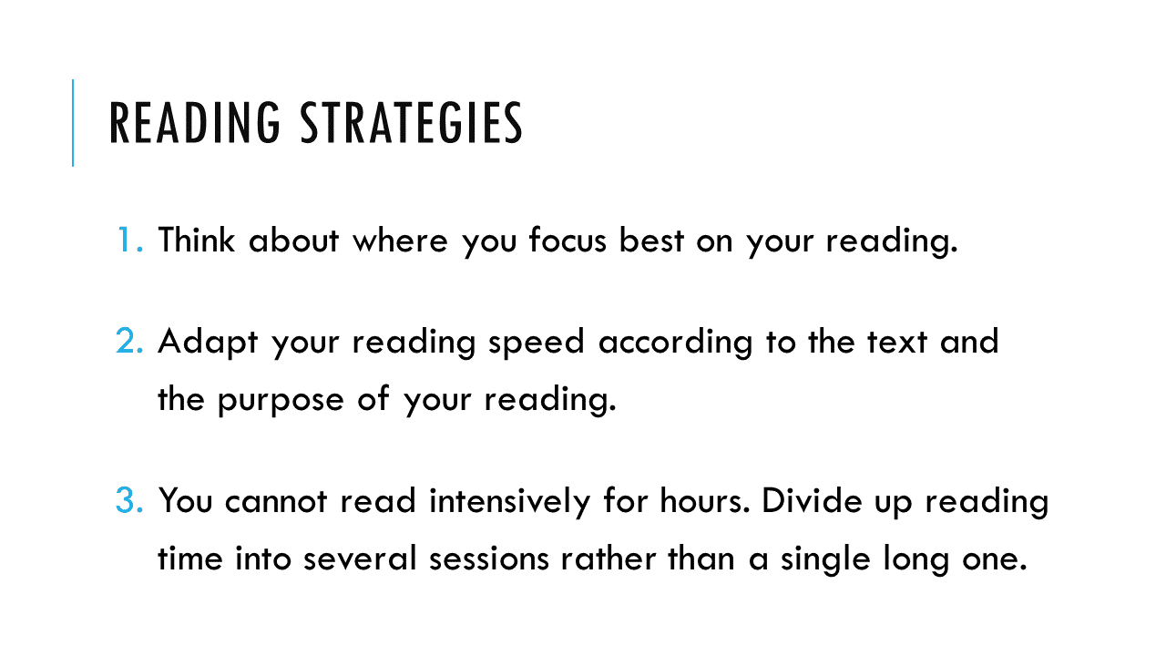
Proposed Solutions
  • In order to increase the contrast between the text/background and make the text more readable; change the slide’s background, change the font style, and put the text in ‘bold’.
  • Summarise the content of the bullet points and increase the spacing between them.
  • Use a smaller space for the slide title.
  • Make the bullet-point numbers more noticeable by changing their colour to ‘sky blue’.

Exercise 5

Issues with the Slide
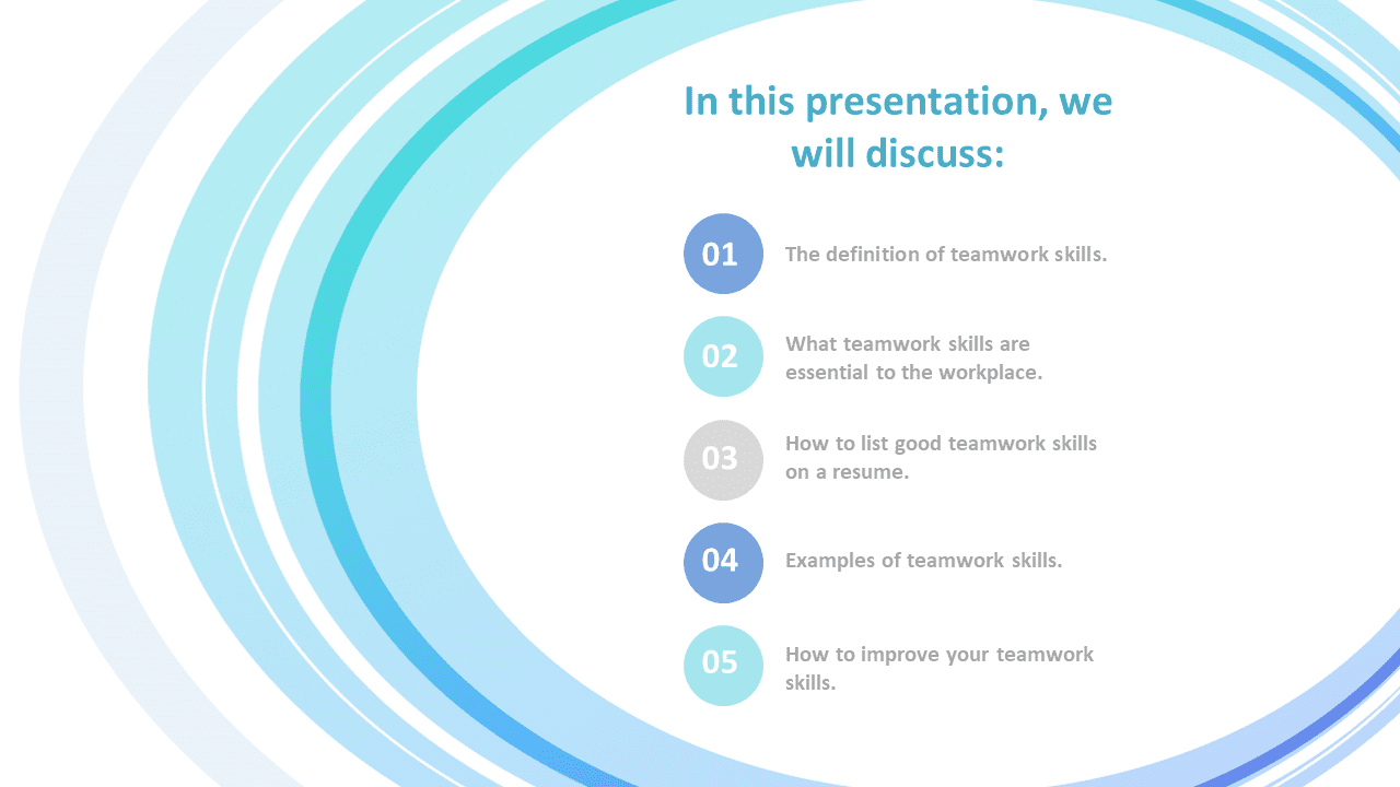
  • The font size is a little bit small, which is partially due to using a template that covers large parts of the slide’s body with unnecessary decorations.
  • The font colour is a little bit light, which makes the text a little bit hard to read.
  • The slide title is unnecessarily wordy.
Proposed Solutions
  • Use a template that does not compromise readability for the sake of aesthetics. In other words, use a template that allocates a reasonable part of the slide’s body for your content.
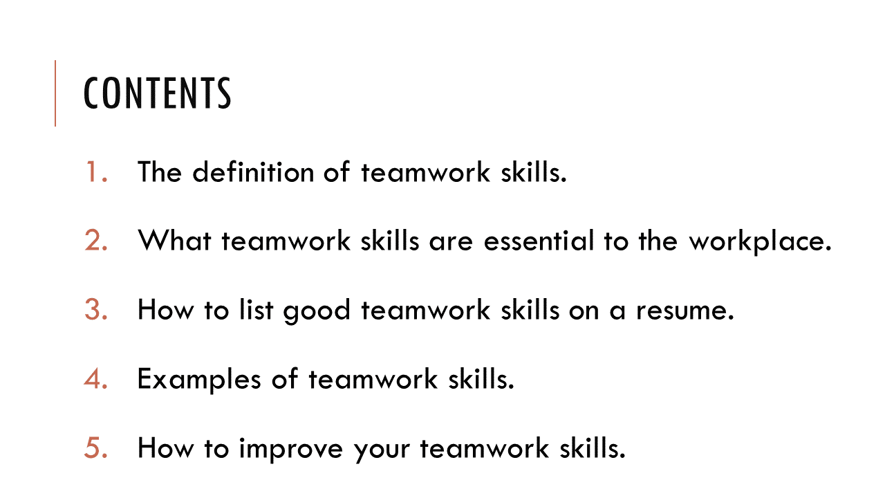
  • To make the text more readable; make sure that the contrast between text/background is appropriate, and increase the font size and spacing between bullet points.
  • Make the bullet-point numbers more noticeable by changing their colour to ‘red’/’orange’.
  • Replace the slide title with something more concise/standard.

In the YouTube video below, I explained the issues in all the five exercises and demonstrated how to fix them and improve the readability of the slides:

How to Improve the Readability of Presentation Slides

Similar Posts

Leave a Reply

Your email address will not be published. Required fields are marked *